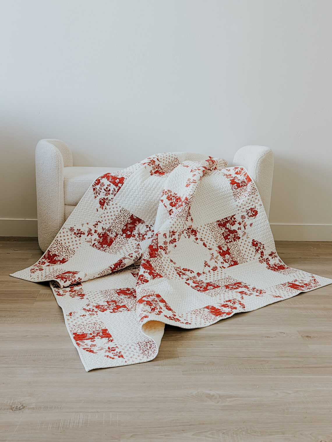
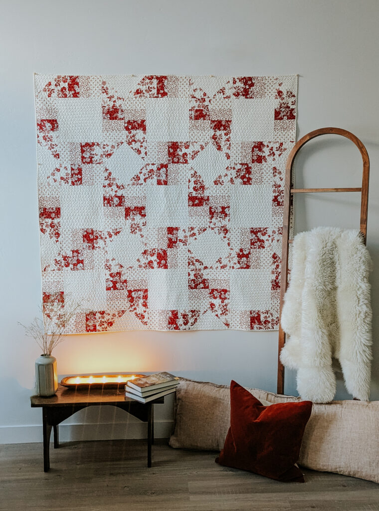
Heirloom Rings Quilt with Heirloom Red
Hi friends! It’s Amy from Ritual Quilt Company. I’m back with another project featuring the gorgeous Heirloom Red Collection. Have you ever considered making a two-color quilt? I’ve wanted to make one for a few years now, but inspiration didn’t strike until this fabric collection came along. Heirloom Red is perfect for creating a two-toned quilt with plenty of interest, since the collection includes so many various prints that pair harmoniously.
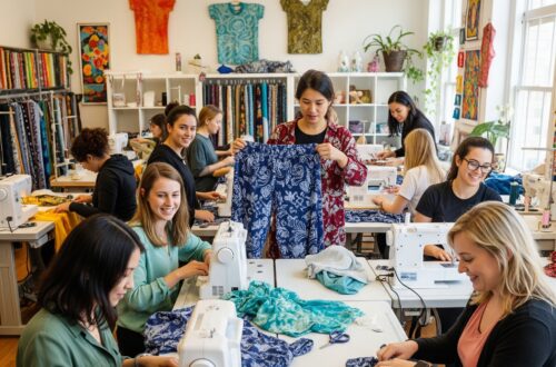
Once I laid eyes on Heirloom Red, I got to work designing a new pattern to showcase the collection, and the Heirloom Rings quilt was born. This pattern is designed to be a quick, satisfying, vintage-meets-modern make. The pattern is appropriate for a confident beginner quilter and features 2-at-a-time HSTs as one element of the block construction. You can purchase the pattern here.
If you are looking to increase your confidence in mixing prints in your quilt, I would suggest working with this fabric collection. The first few times that you experiment with print mixing in your quilts can feel a bit overwhelming. There is color, scale, and print volume to consider when mixing prints. Let’s quickly talk about what each of these terms really mean!
Color: okay, I think you know what color means! While experienced scrappy quilters make it look easy to create a mixed-print rainbow masterpiece, making a cohesive mixed-print quilt using a wide variety of colors is not intuitive for most of us. Heirloom Red allows you to experiment with combining different prints while using a limited color palette (reds and creams), which takes one element of decision making away (you won’t have to ask yourself, “do these colors look good together?”).
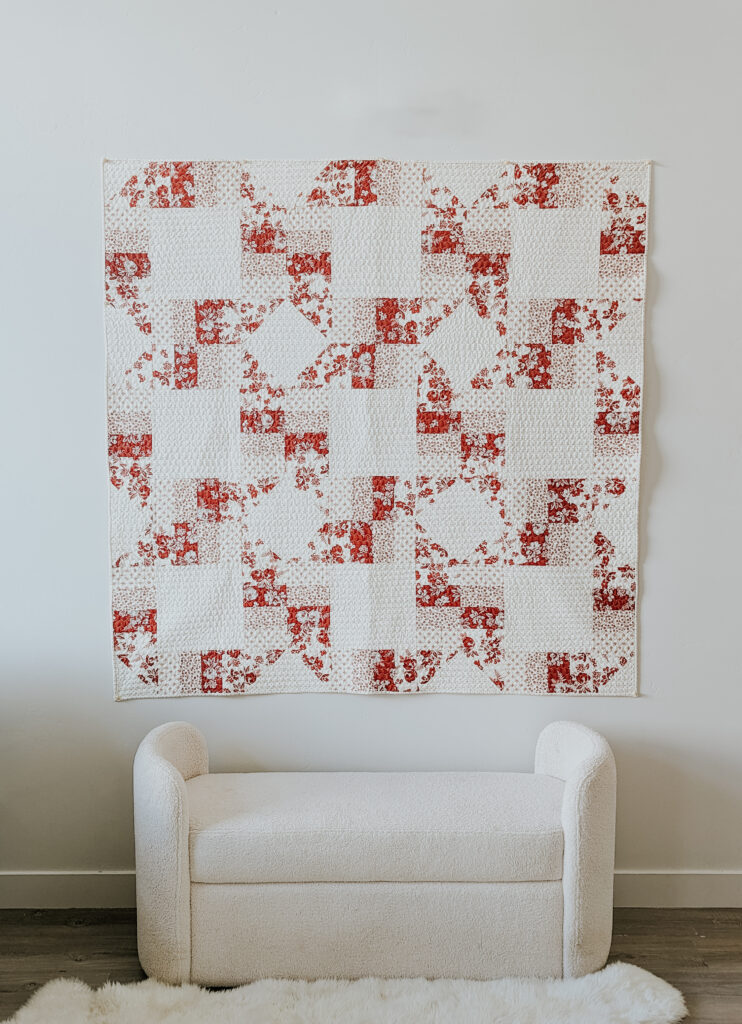
Scale: Scale refers to how large or small the fabric’s print is. When mixing prints, an easy rule of thumb for a good-looking quilt is to combine large- and small-scale prints. If you use all large-scale prints in your quilt, it might appear chaotic and congested. Pairing the boldness of a large-scale print with a quieter or more orderly small-scale print provides balance within your quilt and allows the eye to rest every so often. For example, I placed each bold, large scale floral next to the small-scale prints in the photo below. The small-scale prints differ as well, creating more interest and balance: one is a geometric print (Heirloom Red Fancy Diamonds Cream), and one is a ditsy floral print (Heirloom Red Ditsy Cream).
Volume: Volume refers to the amount of space occupied by a print; another way to explain volume is that it correlates with the amount of visual “noise” within a print. I’m sure you have heard of “low volume” fabrics. Low volume fabrics are printed fabrics that are low contrast and can visually read as solid. Fabrics with white-on-white prints are popular low volume fabrics and often used for scrappy backgrounds in quilts. Another example of a low volume print is the Heirloom Red Cream Criss Cross, which I used as the background fabric in the Heirloom Rings quilt. You can see the print, but it is subtle and “quiet”. In comparison to the other prints used in the quilt, it reads as a solid. When mixing prints within a quilt, it’s a good idea to include some low volumes. Similar to using various print scales, low volume fabrics allow the eye to rest as it peruses your quilt.
If you are new to quilting, I hope these print mixing tips are helpful! The more you experiment, the more confident you will become with prints; Heirloom Red is a great place to start.


7 Comments
Jeanette
Great article, Amy! It was helpful to me going forward in my quilting journey. The quilt is beautiful and romantic!
Amy Mogren
I’m so glad you found it helpful!
Toni Hawthorne McCullough
Beautiful quilt! What is the name of the quilting design you used. I love ❤️ it too!!!
Amy Mogren
The quilting was done using a decorative stitch on my domestic sewing machine- I believe it’s called the serpentine stitch!
Brenda J Keene
This quilt is so fresh and the colors are beautiful together. I haven’t made a two color quilt yet. I think I will give it a try.I love the pattern.
Amy Mogren
This would be the perfect collection for your first two-toned quilt!
Wendy Link
I love this collection! Well done!