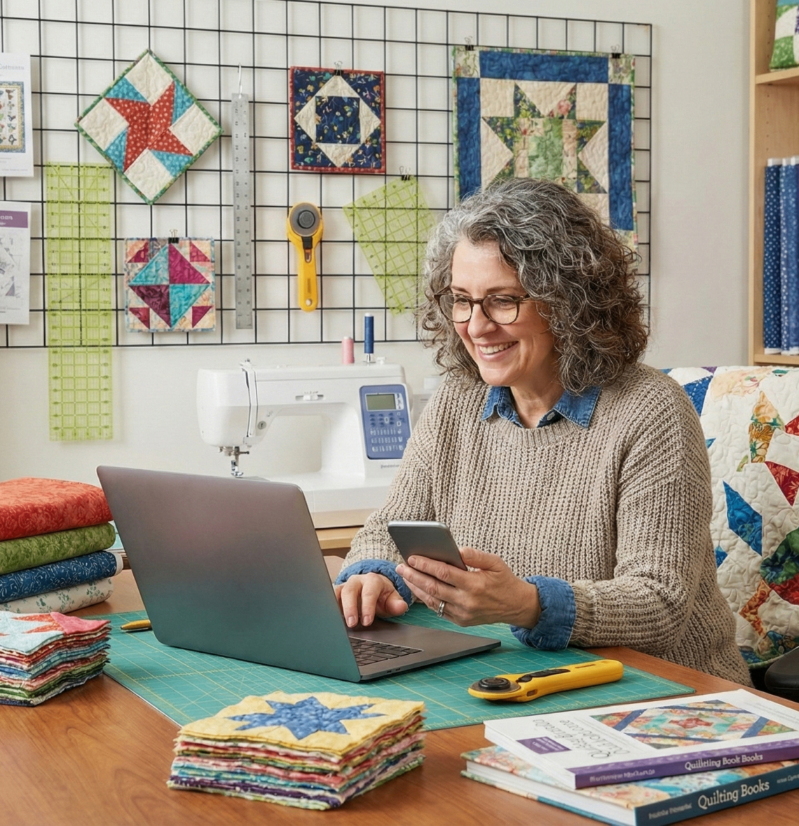
Your Website Should Sell for You
Most quilt shops have a website, but not every website is actually selling. There’s a big difference between an online catalog and an online sales associate. One simply lists inventory. The other guides, suggests, reassures, and quietly increases the cart total while you’re helping a customer at the cutting table.
If your website feels more like a storage unit than a storefront, this is your nudge to level it up.
Stop Building Pages. Start Building Paths.
Many shop websites are organized correctly… but not strategically. We create categories — fabric, notions, kits — and call it done. But shoppers don’t think in categories. They think in projects.
When someone clicks on a fabric collection, they’re not just browsing yardage. They’re imagining a quilt. They’re wondering what pattern works. They’re unsure which basic matches. They’re trying to picture the finished top. If your website doesn’t guide that next step, they have to figure it out themselves. And when decision fatigue creeps in, carts get abandoned.
Instead of simply listing products, start curating paths. Show the coordinating basics right there on the collection page. Display the quilt sample. Mention the backing option. Add a short note like, “Perfect for a quick weekend throw.”
You’re not just selling fabric. You’re selling clarity. And clarity converts.
Merchandise Online the Way You Do In-Store
Think about how you build a display in your shop. You don’t stack bolts randomly and walk away. You style. You coordinate. You create visual momentum. Your website deserves the same care. Flat product listings are functional. Styled bundles are persuasive. A fat quarter bundle photographed together feels intentional. A kit shown next to the finished quilt builds confidence. A curated color stack inspires faster decisions.
When customers can see the finished idea, they hesitate less. And when hesitation drops, conversion rises. Online merchandising isn’t about more inventory. It’s about better presentation.
Friction Is the Silent Sales Killer
Here’s something worth testing this week: pull up your website on your phone and try to buy something. Does it feel smooth? Or slightly annoying? Every extra click matters. Every confusing shipping detail matters. Every required account sign-up adds resistance.
More than half of retail traffic now happens on mobile devices. If checkout feels clunky on a phone, sales slip away quietly.
Often, small tweaks make the biggest difference:
- Clear shipping expectations upfront
- Guest checkout enabled
- A faster-loading homepage
- Fewer required form fields
Your website doesn’t need to be flashy. It needs to be effortless.
The Sale Doesn’t End When They Leave
Here’s the part many shops overlook: most customers won’t purchase on their first visit. That doesn’t mean your website failed. It means you need a follow-up system.
If someone browses batiks and leaves, what happens next? Do they receive an abandoned cart reminder? Are they invited to join your email list with a small incentive? Does your next newsletter feature a batik bundle or project idea?
Email remains one of the highest-converting tools available to quilt shops. It’s not flashy. It’s effective.
Your website and your email strategy should work together — one captures attention, the other nurtures it.
30-Minute Website Tune-Up
If you only have half an hour this week, here’s where I’d start:
- Add one curated page (Staff Picks, Weekend Projects, Beginner-Friendly Kits)
- Cross-merchandise coordinating basics on a top collection
- Test your checkout process on your phone
- Turn on abandoned cart emails if they aren’t already
Small shifts compound quickly online.
Your website doesn’t need more products. It needs more intention.
Industry Insight
Jessica Taylor: Remote Regional Account Executive at Riley Blake Designs
In my experience, the shops seeing the strongest online growth aren’t the ones with the most inventory — they’re the ones who guide the customer. When coordinating basics, patterns, and backing options are clearly shown together, confidence goes up and so does average order value.
Online shoppers don’t have someone standing beside them saying, ‘This would look great with that.’ Your website has to do that job. The shops that make it easy to say yes are the ones consistently growing online.


You May Also Like
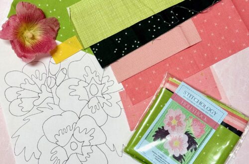
Gosling Tote with Autumn by Lori Holt
The Becoming Quilt in Patchwork