Seeing a Fabric Collection Through a Quilter’s Eyes
Designers and quilters spend hours looking at the same fabric, but they’re rarely looking for the same things.
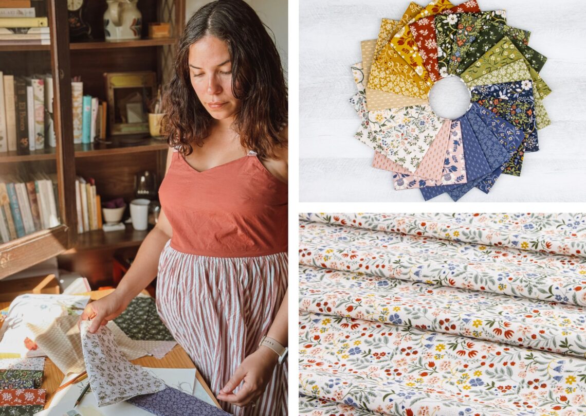
When I’m designing a fabric collection, I’m thinking about color, scale, repeat, and how every print relates to the next. I’ll spend days adjusting the size of a flower, deciding whether a vine needs another curve, or figuring out if a supporting print is doing its job. By the time the artwork is finished, I’ve looked at every detail hundreds of times.
Then the fabric arrives in a quilt shop, and someone else begins a completely different process.
A quilter is imagining quilt blocks, borders, fussy cuts, and seam allowances. They are also considering how each print will work once it has been cut into dozens of pieces. The fabric is the same, but the questions have changed.
I’ve always found that fascinating.
Hi, I’m Danelys Sidron, the designer behind Before the Bloom, now available from Riley Blake Designs. I spend most of my days painting botanical patterns and designing collections for a variety of products, from quilting fabric to heritage-inspired wallpaper for my own brand, Riverpine Studio. No matter where the artwork ends up, I’m always curious to see how people make it their own.
For this article, I wanted to turn the tables a little. Instead of talking more about my design process, I wanted to hear from the people who take the fabric home, cut into it, and turn it into quilts.
I reached out to three quilt designers whose work I admire and asked each of them one question. They asked me one in return.
Along the way, we talked about scale, supporting prints, color, and the decisions that shape a quilt long before the binding goes on.
I hope you enjoy the conversation as much as I did.
Looking at Scale From Two Different Perspectives
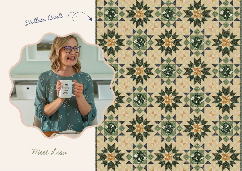
The first person I reached out to was Lisa Donnelly, the designer behind Wild Plum Lane. Lisa is a quilt designer, landscape architect, and artist based in Kansas City, and she has been quilting for more than twenty years.
I wanted to ask her about scale because it affects almost every print in a collection. I was curious about what happens to that scale once the fabric reaches someone’s sewing table.
Danelys: When you’re looking at a new collection, what scale and print direction are you looking for?
Lisa:
For traditional piecing, scale is everything to me. I look for a good range within a collection… small-scale prints and tonal blenders for all those little cut pieces, so seams and points stay crisp and readable, plus a few medium or larger-scale prints I can use more sparingly to highlight on sashing and borders, or even in the center of a block. Before the Bloom has such a beautiful range built right in! Prints like Astrid, Viola, and Iris are wonderful for smaller pieced units, while the Main and Florence prints provide something special to feature in bigger cuts.
Print direction is just as important! I gravitate toward non-directional, tossed, or all-over prints, since traditional piecing involves so much cutting, flipping, and rotating of pieces that a strongly directional print can end up sideways in the finished block. This goes double in foundation paper piecing, where fabric gets flipped even more. The tonal blenders and dot basics that coordinate with this line are exactly the kind of forgiving, go-any-direction prints I love having on hand.
Lisa’s answer made me think about what happens to a print after the first cut. A floral that feels bold on the bolt can become a texture inside a small block, while a simple coordinate may end up carrying much more of the quilt than I expected.
The scale of the artwork stays the same, but the way it reads depends on how much of the print the quilter uses. That is why a collection needs enough range to work in large areas, narrow borders, and small pieced units.
Lisa turned the question back to me.
Lisa: When you’re designing a collection, how do you decide the scale of each print?
Danelys:
Once the color palette has a direction, I focus on the hero print. For Before the Bloom, that was the Main print. It establishes the largest scale in the collection, and from there I begin developing smaller prints that can work beside it without repeating the same job.
Throughout the process, I print everything on letter-size sheets and pin them to my studio wall. It is one of the easiest ways to tell if something feels too large, too small, or crowded before it reaches fabric. I also keep samples from previous collections nearby because comparing prints at an actual production scale tells me much more than looking at them individually on a screen.
After I hand the collection over to the Riley Blake Designs team, we review the scale and spacing together. Sometimes a motif needs to be simplified, a print needs more open space, or the scale needs a small adjustment so the artwork reads better on fabric.
Those changes may seem minor while we are reviewing the files, but they can make a real difference in the finished collection. Their feedback has helped me understand how much information a print can carry and when a design needs more room to work.
The Prints That Hold a Collection Together
When people first see a fabric collection, their attention usually goes to the hero print. It may be the largest floral, the strongest color combination, or the design that shows the most detail.
Those prints are exciting to create, but they cannot carry a full collection on their own.
The supporting prints need to connect colors, add contrast, and give quilters options for smaller pieces. They also need enough personality to work beyond the background without competing with every fabric around them.
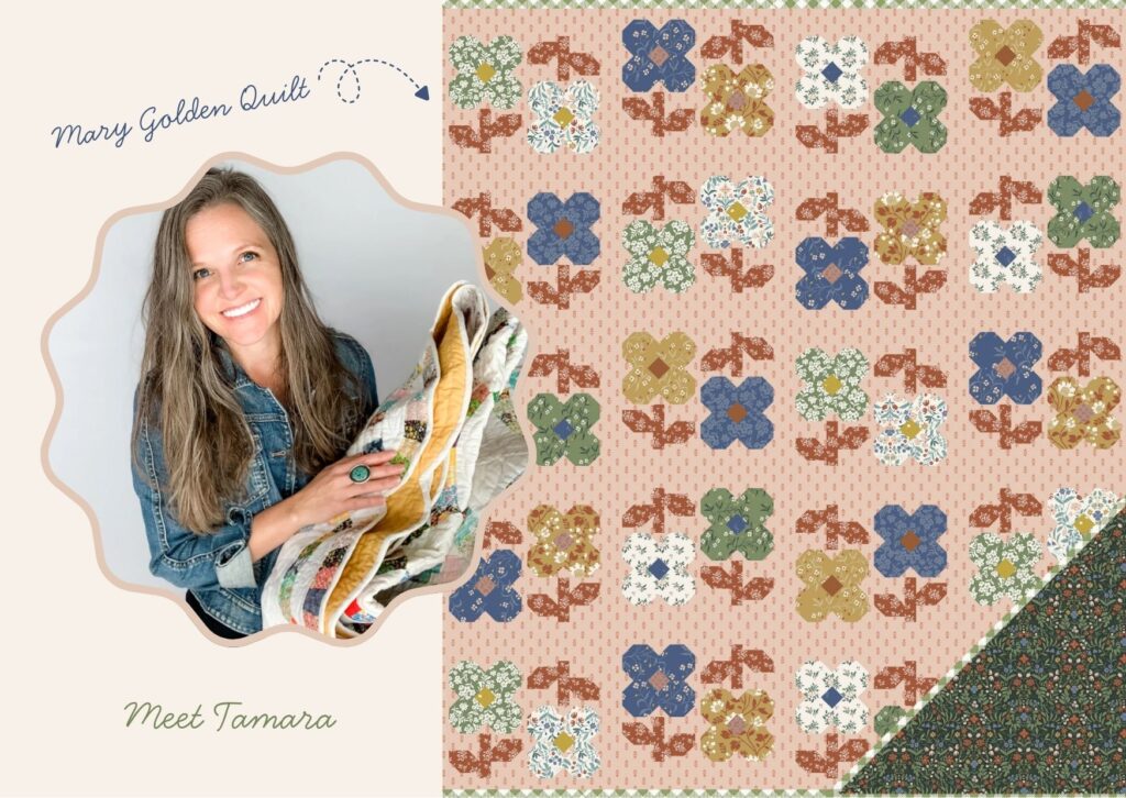
The next person I called was Tamara Darragh, the designer behind Remi Vail Studio. She creates quilt and bag patterns inspired by nature, and I wanted her take on the prints that may not get the first look but often end up doing much of the work.
Danelys: How do you decide which blenders to bring in alongside a collection?
Tamara:
I think blenders are some of the hardest-working fabrics in a quilt. I’m always reaching for stripes, dots, plaids, small-scale prints, and fabrics with beautiful texture because they add movement and depth without stealing the spotlight from the collection.
From there, I’m looking at color, value, and scale. I want each fabric to have a purpose. Sometimes it’s adding contrast, sometimes it’s softening a transition, and sometimes it’s simply giving your eye a place to rest. When everything comes together, the blenders don’t feel like an afterthought. They feel like they belonged there all along.
Tamara’s point about each fabric having a purpose is exactly how I approach building a collection.
I am not thinking about creating twenty-one separate prints that happen to share a palette. I am looking at what each design contributes. One coordinate may repeat a color from the Main print at a smaller scale. A dot can add texture without introducing another floral. A simpler design may create the contrast needed between two busier prints.
Those supporting prints may not be the first ones someone notices, but they are often what makes the collection easier to use.
Tamara’s question moved the conversation from the individual prints to color.
Tamara: How do you land on a colorway? Where does that process start?
Danelys:
Color usually comes before anything else.
Long before I start painting flowers, I collect combinations that catch my attention. They may come from a garden, an old book cover, a painting in a museum, or a faded piece of fabric I find while traveling. Anything that makes me stop and look twice goes into that visual library.
Once the palette has a direction, I begin painting and seeing how those colors behave across several prints.
The first version is almost never the final one. A green may need more warmth, a pink may work better with less saturation, or a darker shade may need more contrast once it sits beside the rest of the collection. A color can look right on its own and feel completely different when it becomes part of a larger group.
By the time the Riley Blake Designs team sees a collection, I have usually been living with it for months. That is one of the reasons their input has become so valuable to me.
We compare colorways, look at how the prints work together, and talk through changes that could improve the collection as a whole. Sometimes they ask a question I had not considered because I had been looking at the same palette for too long. Other times we compare several small variations before finding the one that works best.
After working together for so many years, I can see how much those conversations have shaped the way I design. They have helped me look beyond the color I may personally prefer and ask what the collection needs. Before the Bloom is stronger because of that collaboration, and I am very grateful for the experience and care the Riley Blake Designs team brings to each collection.
When I look at Before the Bloom now, I do not think about choosing one favorite colorway. I look at how the full palette works together and how many different directions a quilter could take it.
Choosing a Collection
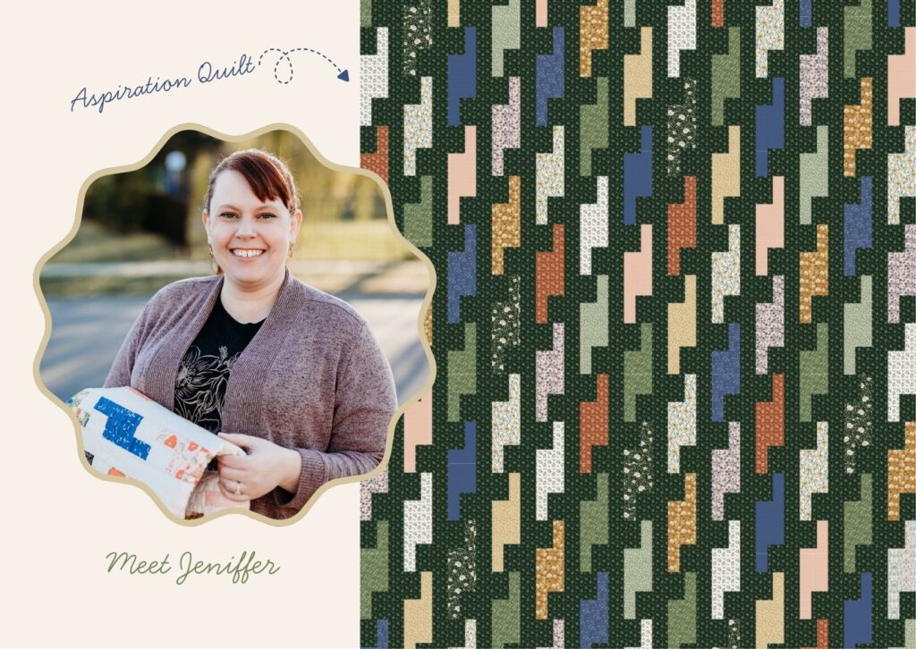
Designers spend months deciding which prints belong in a collection. Quilters meet that collection after those decisions have been made and have to answer a more immediate question: do I want to make something with it?
Jennifer Walters is the designer behind Manderley Makes, She creates quilt patterns for traditional and modern quilters. After more than a decade of quilting, she knows what makes a fabric collection useful beyond the first impression.
Danelys: What makes you choose one collection over another when you’re starting a new project?
Jennifer:
Color, first and foremost. It’s the color palette that initially pulls me in, and a well-balanced palette in colors I’m drawn to will win me over every time. Once I’m hooked on the colors, I look at the prints themselves. I want to see tonal prints or neutrals mixed in, because those pieces are needed to keep a quilt project from feeling too busy. If a collection consists only of loud prints and you put them all next to each other, there is nowhere for the eye to rest. I’m also thinking about how the prints will actually behave in a quilt. Does this one lend itself to fussy cutting, or is that one still going to be pretty when I cut through the middle of a motif?
Often, I fall for a collection with no project in mind. I just know I have to have it, usually because of the colors, and I’ll figure out what it wants to be later. Other times I’m deep into a pattern and it hits me, “Oh, that collection would be perfect for this!”
Jennifer’s answer separates the first attraction from the practical decision that follows. Color may be what makes someone stop, but the range of prints helps them decide what the collection can actually do.
That distinction matters while I am editing a collection. Not every design that works on its own belongs in the final group. Sometimes I remove a print I love because another fabric is already doing the same job. In other cases, a much simpler design earns its place because it gives quilters more room to build contrast.
A useful collection also needs to work for someone who falls in love with the fabric before choosing a project and for someone who starts with a quilt pattern and needs fabric that fits it.
Jennifer then asked how directly I think about the quilter while I am working.
Jennifer: How do you think about the quilter while you’re designing? Are they in your head while you work?
Danelys:
They are much more present in my process now than when I designed my first fabric collection.
I come to quilting from the design side, so listening to quilters has become an important part of how I work. I cannot predict every block, cut, or pattern someone may choose, but I can make sure the collection gives them options.
I look for a useful range between focal prints and smaller coordinates. I check that there is enough contrast between fabrics and that the collection does not depend on every design being used at a large scale. Direction matters too, especially when a print may be cut, flipped, and rotated through many pieces.
Those questions have become part of my process because I have spent more time looking at finished quilts and talking with the people who make them.
Designing wallpaper and designing fabric also ask very different things of a pattern. Wallpaper gives me room to work across an entire wall. Fabric asks me to consider what happens when only a small part of the artwork remains visible.
My job is to give quilters a collection with enough range to support their ideas. They decide where the focal print belongs, which colors lead, and what the finished project becomes.
Celebrate the Launch
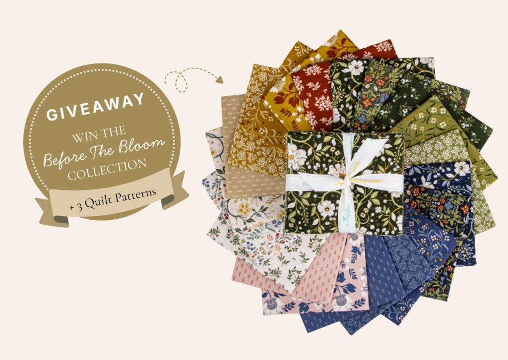
To celebrate Before the Bloom, Lisa, Tamara, Jennifer, and I put together a giveaway for the quilting community.
Each designer created an original digital quilt pattern using the collection. You can win all three patterns along with fabric.
Grand Prize
• Before the Bloom Fat Quarter Bundle from Riley Blake Designs
• Digital quilt pattern from Lisa Donnelly of Wild Plum Lane
• Digital quilt pattern from Tamara Darragh of Remi Vail Studio
• Digital quilt pattern from Jennifer Walters of Manderley Makes
Second and Third Prize
- One digital quilt pattern from each of the three collaborating designers.
Entering takes less than a minute.
The giveaway runs from August 4 through August 11, and we will announce the winners on August 13.
More Than Fabric
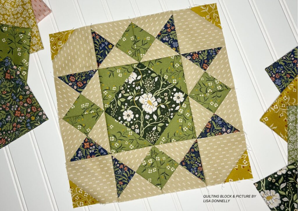
Once a fabric collection is printed, the hierarchy I created for it is no longer fixed.
A print I designed as a coordinate may become the focus of someone else’s quilt. A large floral can be cut into small pieces until it reads as color and texture. The colorways can be separated, mixed together, or combined with fabrics from another collection.
That freedom is one of the reasons I enjoy designing for quilting.
Lisa, Tamara, and Jennifer each looked at Before the Bloom through the needs of their own work. Lisa considered what would happen to the scale and direction during piecing. Tamara looked at the jobs performed by blenders, color, value, and contrast. Jennifer considered what would make her choose the collection and how the prints would behave once she started cutting.
Their answers gave me specific things to carry into my next fabric collection. They also reminded me that the usefulness of a collection depends on more than how it looks on the bolt.
I am grateful to Lisa, Tamara, and Jennifer for sharing their experience and creating patterns for this launch. I am also grateful to the Riley Blake Designs team. Their years of collaboration, feedback, and trust have helped me grow as a fabric designer.
If you are sewing with Before the Bloom, I would love to see what you make. Tag @rileyblakedesigns and @danelyssidron on Instagram so we can follow along and celebrate your project.
Shop the Collection
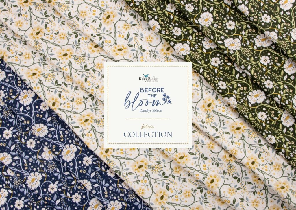
Before the Bloom is now available through Riley Blake Designs and independent quilt shops.
If you do not see it at your favorite local shop, ask if they can order it for you.
About Danelys Sidron
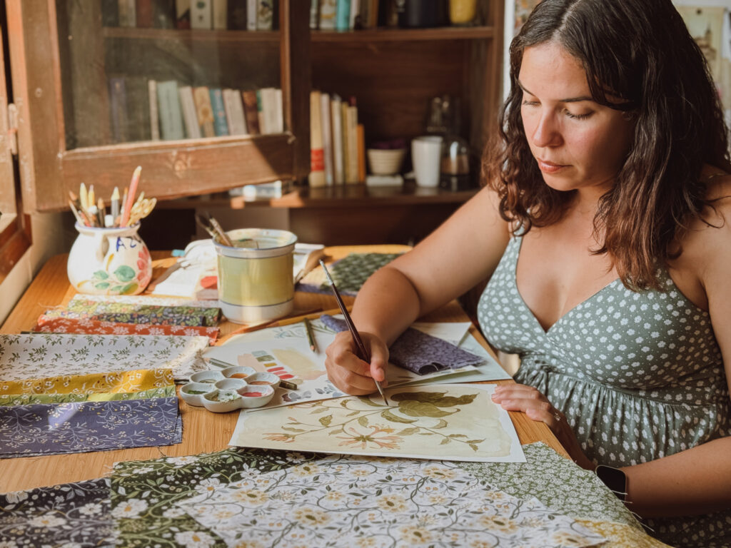
Danelys Sidron is the artist behind Before the Bloom and the founder of Riverpine Studio, where she designs heritage-inspired wallpaper collections for the home. Alongside her work with Riley Blake Designs, she licenses artwork across a variety of products, including fabric, home décor, stationery, and giftware.
If you are seeing my work for the first time through Riley Blake Designs, I would love to stay connected.
Explore My Work
Riverpine Studio:
https://riverpinestudio.com
Licensing Portfolio:
https://danelyssidron.com
Instagram:
@danelyssidron


You May Also Like
6 New Free Quilt Patterns!
Ocean Oasis by Diane Labombarbe