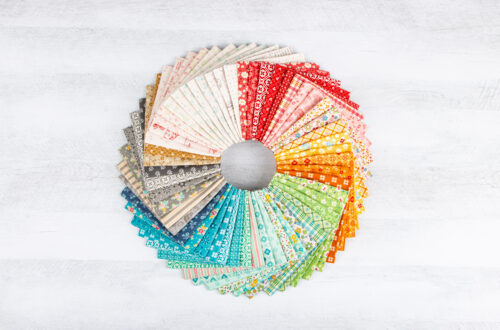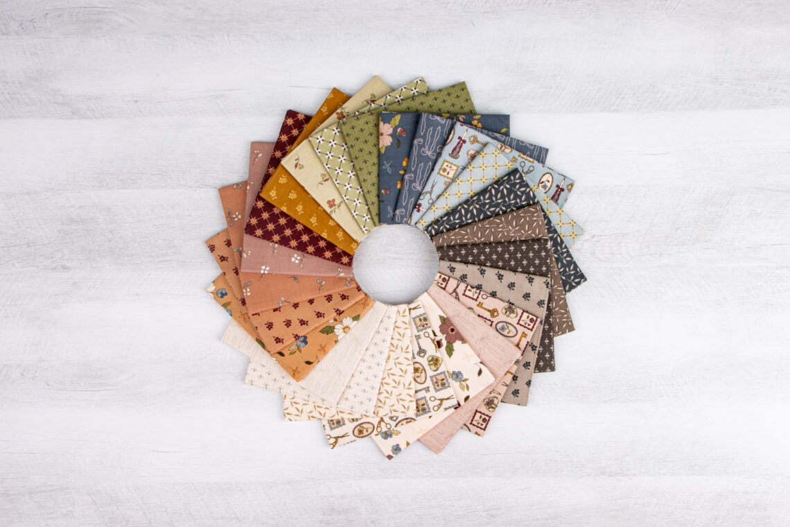
Designing with Color: Put Color Theory to Work in Your Shop
You already know that color can change the way a quilt feels, make a fabric combination sing, and turn a simple bundle into something customers can’t stop looking at. But knowing the color wheel is only the beginning—what really matters is knowing how to use it.
Now that we’ve covered the basics of color theory and explored ways to bring color into your shop, let’s take it one step further. Use those same principles to create DIY bundles, guide customers through fabric selection, and make color feel less intimidating and a lot more fun.
The goal isn’t to find the “perfect” combination. It’s to give yourself and your customers the confidence to experiment, try something unexpected, and see possibilities they may not have noticed before.
Turn Color Theory into DIY Bundles
Color theory is a great starting point for creating your own bundles. Choose a color story, then curate fabrics that bring it to life.
Try a few different approaches:
– Monochromatic: One color in a range of shades, values, and prints.
– Analogous: Colors that sit next to each other on the wheel for a harmonious palette.
– Complementary: Opposite colors for a bold, high-energy combination.
– Neutral + Accent: A foundation of neutrals with one or two colors that pop.
– Unexpected Pairings: Start with a familiar color combination, then add one surprising fabric to make it feel fresh.
The key is to think beyond matching. A successful bundle doesn’t have to contain fabrics that are all the same color or obviously coordinated. Differences in value, scale, texture, and saturation can give a bundle personality while the overall color story keeps everything connected.
Try creating a few small bundles as “color recipes.” Give each one a name, a project idea, or a quick description of the mood it creates. You’re not just selling a group of fabrics—you’re giving customers a starting point for their next project.
Help Customers Build with Confidence
One of the best opportunities to use color theory is right at the cutting table.
When a customer brings you a fabric they love and asks, “What goes with this?” use that first fabric as your starting point.
Look at its dominant color, then notice the supporting colors within the print. From there, explore the color wheel together. Try an analogous color for a softer look, a complementary color for contrast, or a neutral to give the palette some breathing room.
Then look at value and scale.
If their first fabric is a large, busy print, try pairing it with smaller prints, solids, or textures. If everything they’ve chosen is dark, introduce a lighter fabric to create contrast. If the colors are beautiful but feel a little flat, look for a fabric that adds a different value or intensity.
You’re not choosing the quilt for them—you’re giving them the tools to make a choice they feel good about.
Make Color Part of the Shop Experience
Color theory doesn’t have to stay behind the scenes. Make it part of the fun!
Consider creating a small color inspiration area where customers can see different palettes together. Display a color wheel near your fabric selection area. Create a “Try This Color Combo” bundle each month. Or build a display around an unexpected color pairing and invite customers to find their own version.
You could even turn color selection into a mini activity during a class or shop event: choose one fabric, identify its dominant colors, and challenge customers to build a five-fabric palette around it.
The more customers see color as something they can experiment with instead of something they have to get “right,” the more confident they become.
A Color Theory Cheat Sheet
Keep these questions in mind when you’re working with bundles or helping customers choose fabrics:
– What is my hero color or fabric?
– What mood am I trying to create?
– Would an analogous palette create harmony?
– Would a complementary color add energy?
– Do I have enough contrast in value?
– Are my fabric scales varied?
– Would a neutral give the eye a place to rest?
– Is there one unexpected color that could make the palette more interesting?
Color theory doesn’t need to feel complicated or academic. You already have the tools—you’re just using them with a little more intention.
When you use color to build bundles and guide customers through fabric selection, you’re doing more than helping them find coordinating fabrics. You’re creating inspiration, simplifying choices, and helping customers see what’s possible.

You May Also Like

You’ll Be Floored!
Attract New Customers with Holiday Giftables