Hue Knew? Simple Color Tricks That Make Your Displays Pop
Walk into any quilt shop and one thing immediately sets the tone: color.
It’s what draws customers across the room, what makes them stop and touch a bolt, and what turns a “just browsing” visit into a full basket. The best part? You don’t need an art degree to make color work for you—you just need a few simple strategies.
In my experience, the shops that feel the most inspiring (and sell the most fabric) are the ones that use color with intention, not just availability.
Start with a Clear Color Story
One of the easiest ways to elevate a display is to stop trying to show everything at once. Instead, build your display around a clear color story:
- Warm tones (reds, oranges, yellows)
- Cool tones (blues, greens, purples)
- Neutrals + a pop color
- Seasonal palettes (spring pastels, fall earth tones)
When everything in a display “belongs” together, it feels calmer, more curated, and easier to shop.
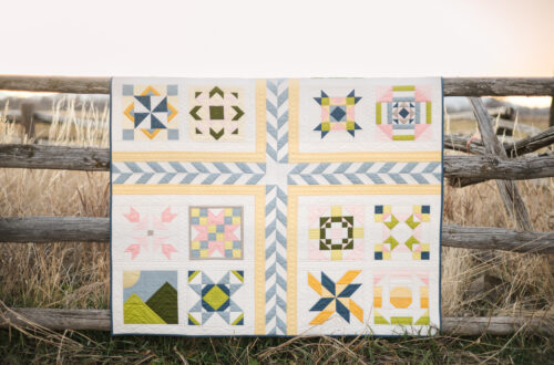
In practice: Instead of placing new arrivals wherever there’s space, group them by color family to create an instant visual moment.
Use Contrast to Catch Attention
If everything blends together, nothing stands out. That’s where contrast comes in:
- Light vs. dark
- Bold vs. soft
- Prints vs. solids
Contrast creates those little “pause moments” that pull customers in—and that pause is often what leads to a purchase.
Try this: Place a bold, high-contrast fabric or quilt sample in the center of your display, then build around it with coordinating pieces.
Pair Color with Projects for Instant Inspiration
Color alone is powerful—but color + context is what really sells. When customers can see what the colors become, decision-making gets easier.
Merchandising tip:
- Pair color-coordinated fabrics with a quilt top, kit, or pattern
- Highlight 2–3 “hero” fabrics and show how the rest support them
- Use pre-cuts or bundles to reinforce the palette
This turns your display from “pretty” into “I need that.”
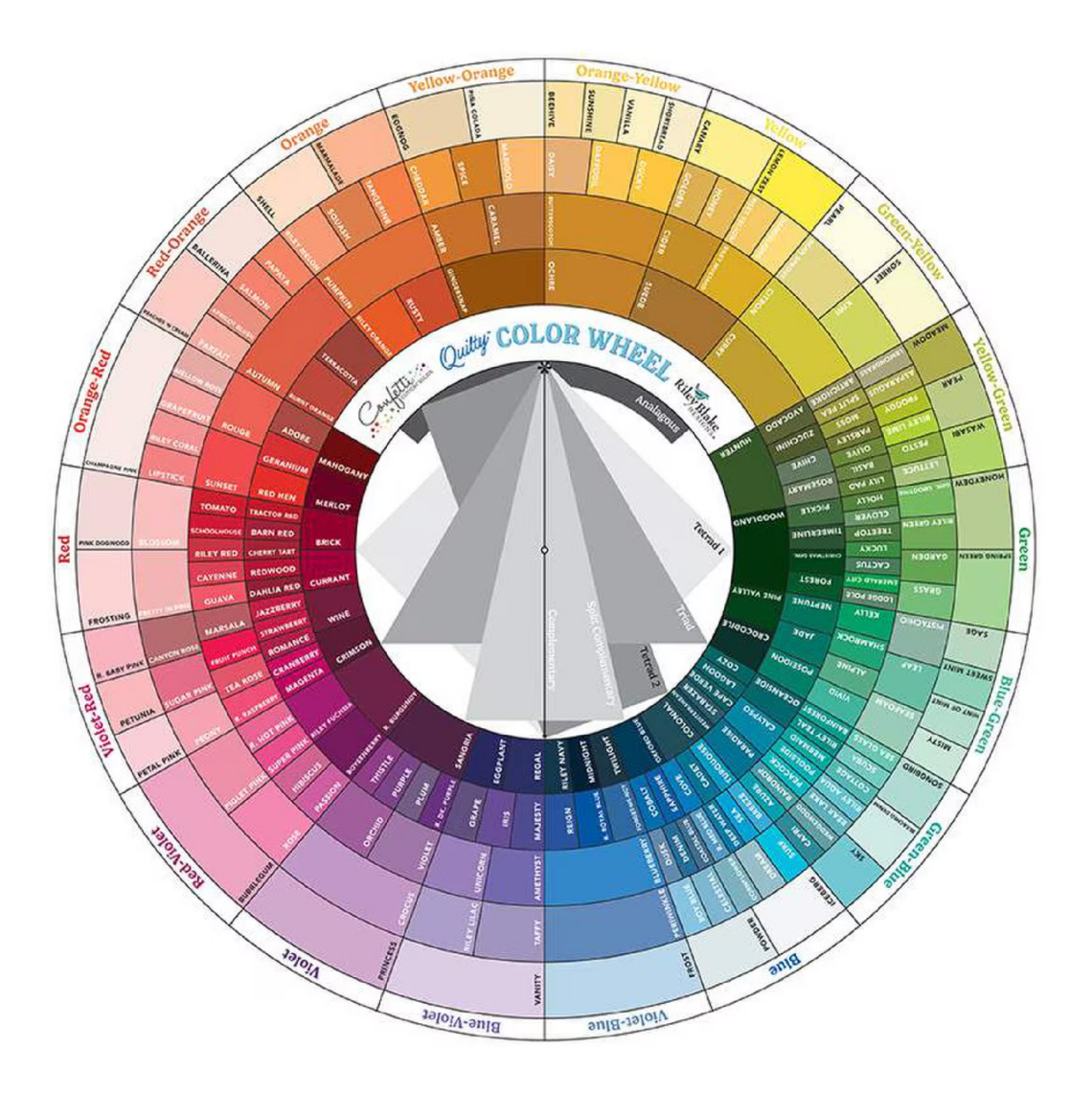
Using Color Theory Online (Yes, It Matters Just as Much)
Your online shop and social feeds are often your first impression—and color plays just as big of a role there. The same principles apply, just in a slightly different way:
- Group products by color in collection pages or featured bundles
- Use cohesive color palettes in email graphics and website banners
- Arrange social posts so your grid feels visually balanced, not random
Easy win: Create color-themed product bundles or “shop by color” categories. It makes browsing simpler and encourages customers to add multiple items to their cart.
Another tip: When photographing products, keep backgrounds and props consistent so the fabric colors stay the star of the show.
Keep It Fresh (Without Starting Over)
You don’t need to completely redo your shop to keep things exciting. Small color shifts can make a big impact:
- Rotate which colors are front and center
- Swap out one accent color in an existing display
- Refresh with seasonal palettes using fabrics you already have
In my experience, even a small color refresh can make regular customers feel like there’s something new to discover.
Quick Checklist: Using Color Theory in Your Shop
- Choose a clear color story for each display
- Use contrast to create a focal point
- Keep displays cohesive instead of overcrowded
- Pair fabrics with projects or patterns for context
- Refresh displays with small color changes regularly
Quick Checklist: Using Color Theory Online
- Organize products or bundles by color
- Keep website banners and email graphics color-cohesive
- Create “shop by color” categories
- Maintain consistent backgrounds in product photos
- Plan social posts so your grid feels balanced and intentional
Industry Insight
Holly Draney: VP of Design and former Quilt Shop manager
“In my experience managing a quilt shop, color was always one of the fastest ways to shift sales without changing inventory. When a display felt off, it usually wasn’t the product—it was the way the colors were competing instead of working together.
Some of our most successful moments came from simplifying. Pulling a few fabrics out, tightening the color palette, and giving each piece a purpose made the entire display feel more approachable—and customers responded to that immediately.
Color doesn’t have to be complicated to be effective. When it’s intentional, it naturally guides your customer, builds confidence in their choices, and makes it easier for them to say yes.”


You May Also Like
Maisons de Patchwork Quilt Boxed Kit

Autumn Afternoon by Heather Peterson